Infatuated with the Preview March 2013 cover
Friday, March 1, 2013 at 7:29PM I rarely read magazines but I love LOVE looking at magazine covers. Do you know why? They capture the mood of the month. The covers tell the fashion story of the next 30 days, like a synopsis for us avid followers.

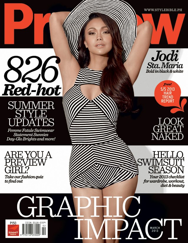
I saw this the March Preview cover the other day and I was literally stunned. As in I looked at it for a good 15 seconds! I'm addicted to anything striped at the moment so this one-piece tickled my little black-striped heart. Lol. As for the makeup, I wished they used a hot color on Jodi's lips instead of nude. I know that's cliche, but if you kinda zoom your eyes out her face just melts in the background. Everything else is in sharp graphic contrast!
Otherwise, her makeup is impeccable. Jodi looks divine and not in a 'shopped way. I saw an Instagram of her the other day and she looks exactly like this. ;) So yes girls, that's the trend for March! Stripes, black and white combinations, and shocking pops of color. Does it look like something you'd go for?


Reader Comments (27)
I can appreciate the magazine cover layout and Jodie herself pero a black-and-white summer trend, not so. Mas gusto ko pa rin ang colorful summer. That's just a personal preference.
Jodi's so beauty is so natural and refreshing. I love watching her on TV. On trends, I'd still prefer a colorful summer. It sets the mood. Seeing colors make me feel happy. The summer trends feels like monotone.
I love her outfit! The way the stripes are arranged makes it flattering for her (or any?) body type. Her hair is arranged pretty nicely too!
Yes, stripes, stripes, and more stripes! This trend is so YOU, I mean, whenever I see black and white paired with red, I always think of vintage fashion, and when I think of Vintage fashion, laging Project Vanity.
P.S. her hair is asdfghjkl words can't even describe it amazinggggg
Jodi looks so stunning here! It really looks classy and vintage yet smoldering!
Oh my they photoshopped her armpits away! It's a stunning cover otherwise though.
Wow, you really have a good eye for these kind of things! Impeccable taste too! This suit is soo vintage forties. Kinda reminds me of Ashley Judd in her movie, Divine Secrets of YaYa Sisterhood.
Ohh, stripes! Not the usual summer trend but I love it! I hoard black and white stripe-patterned stuff, and I'm glad I can use them this summer. Heee. :) Saw this cover on twitter first and what caught my attention is its striped bgd. I agree that a bright lip color (orange perhaps?) would make Jodi's face stand out but maybe the intent is for the readers to focus on the "graphic impact" of the black and white contrast. :)
More used to being flowery and colorful pag summer. This trend is a breath of fresh air. I love Jodi! :)
I had to do a double take! May hawig ky vicki belo although idol ko di jodi. Love the swimsuit
She looks gorgeous! I agree, the lips kinda looks too... blah. I love the shade though, it just doesn't do her any good in that picture. I love this cover! I love Jodi!
I had to do a double take! May hawig ky vicki belo although idol ko di jodi. Love the swimsuit
I love anything with stripes. And polka. And anything vintage- y for that matter. 80% of my swimsuits are polka and stripes. Yeah, a bit boring cos its a black and white combo but its timeless. Win win for me.
Stripes? Black? and White? YES PLS! I love muted colors and black and whites are my staple colors. More than half of what i own are in black, white, blue and grey.
I'm kinda surprised when i saw this summer issue because I'm used into seeing colorful outfits for summer. Anyway, she looks gorgeous here, love her hair and make up! Though I also think hot color, like red lips maybe, would also look better.
You were right about having more summer-y color for the lips just to make it summer-fun...
Love!! I like the graphic suit matching the hat. Like 50s/60s w a modern vibe?! I think I like the muted lip better. A red lip might compete with the rest of the outfit which probably is the focus of the cover. Its just me though :) I remember Previews last summer cover, Angel Locsin wearing swimsuit w a coat. Think its LV. What?!? Coat for summer?? At least they got it right w this cover.
I love the pinup trend and I'd most definitely go for this! Mine are usually black though. I just feel much more sexier in black hehe ;)
I love everything about this cover but her face. It's so... blah.
Jodie looks so pretty in this cover. Preview did a great job in letting people know that there's so much more to her than cutesy roles. She looks old Hollywood here. Nice. :)
I'm a black/white stripes girl - always have been, always will be.
And I agree, this cover would be so much better with bold, hot pink lips.
Whoa, HOT! I really like Jodi since her Tabing Ilog days hehe Very simple yet classy ang peg. I really like how she looks here though, tempting nga to put red lipstick on her, but that would defeat the whole monochromatic theme they're going for siguro. :)
Hi Ms. Liz! I recommend that you read more magazines! haha 'cause it's very fun haha I think though, in my opinion, Jodi's nude lips are okay because her face is the total contrast of the overall print of the cover which makes us focus on it more haha anyway, that's from a designer's pov though still learning about make-up haha go for the gold Ms. Liz! :)
MAYA!!!!!
I love her lip color!!!
The face can be better though.
Good thing naman at umayos na ang Preview.
For ilang covers na din na parang meh lang sila.
The cover layout is really good.
Welcome back Preview!